OvalX Payments
Improving user experience on the payment section
Overview
OvalX is a professional trading platform and app. Users deposit money into the app to invest on financial products.
My role & responsabilities on this project
I worked as a solo designer on this project, and I partnered with a product manager, operations, compliance, payments and customer service stakeholders.
🔎 Exploration phase:
The problem from a business outlook
The number of deposits and transactions made on the platform was very low.
The transaction management of Operations department is highly manual.
The business goal
The main aim of this project from a business perspective was to increase the number of deposits in OvalX.
Understand the challenge
Tested different scenarios of the user flow
Use cases to help me understand gaps of knowledge that I checked with CS and Compliance depts.
Partnered with CS department to understand user pain points
The business direction of redesigning payments section came before understanding the problem. Besides knowing that the number of users depositing was low, there was no other reference of what was not working.
Due to compliance limitations and time constraints we couldnt interview users, so to frame the problem from a user perspective, I partnered with Customer Service to get qualitative data about our users & their pain points during the payments journey. This is what we found:
User pain points
Deposit related
Withdrawal related
Other activites during this exploration phase included:
Recap of legacy tickets waiting on backlog for development. I keep for after the ideation session to see if they match any action that would mitigate user pain points.
Market research
✍🏼 Define phase: Problem statement
First problem statement (Deposit related):
The OvalX user is a trading investor who needs to deposit funds in a fast, smooth & intuitive way because they want to use their deposit funds straight away to buy derivatives in our platform.
Second problem statement (Withdrawal related)
The OvalX user is a person who needs to understand how & how much funds they can withdraw in a simple, clear way because they want to recover the money they invested.
💡Ideation phase:
Brainstorming with stakeholders & Mental model
After reviewing user pain points with stakeholders, we generated an ideation statement, shared some ideas as possible solutions & voted on these first ideas.
I later on placed ideas on a mental model, together with those requirements gathered to later on move on to protoyping phase.
Ideation session
Mental model
“How might we encourage users to deposit & withdraw in an effortless and clear way?
✏️ Design phase:
Ideas that came out of ideation phase
Idea & prototype
Card management section
Add a new management payment section, where cards used on deposit will be automatically saved. On this section user can also add cards, edit the card alias, delete cards & see when a card is expired or expiring soon.
This section was created mainly to store payment options that can display on deposit flow, facilitating rates of recurrent deposits overall.
Idea & prototype
Deposit flow
Simplify deposit experience for users who do recurrent deposits
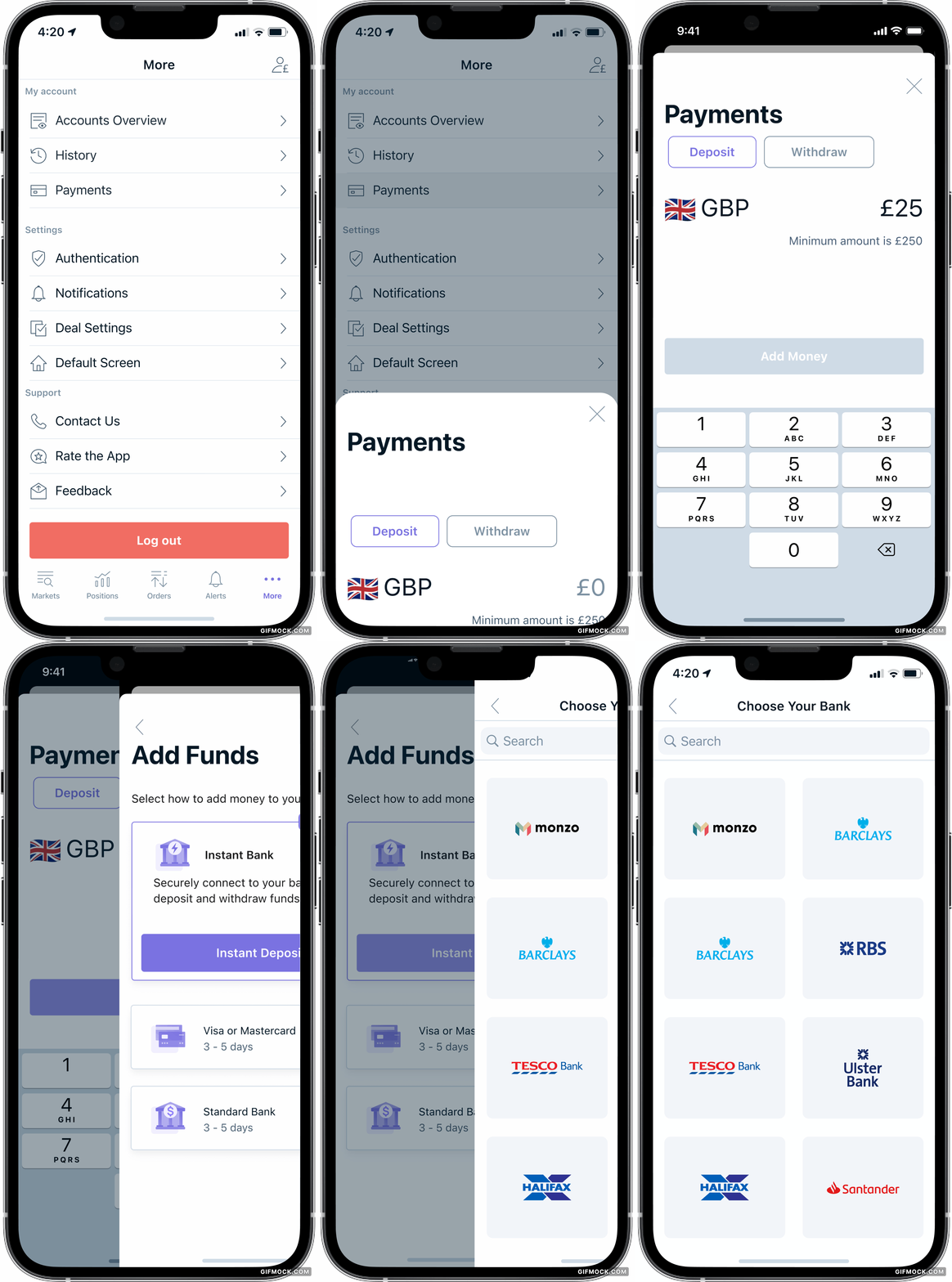
Deposit flow will show a simpler interface, that remembers previous payment methods used. This allows users to skip some steps for both Open banking and card deposits, making transaction faster and smoother.
Idea & prototype
Error handling
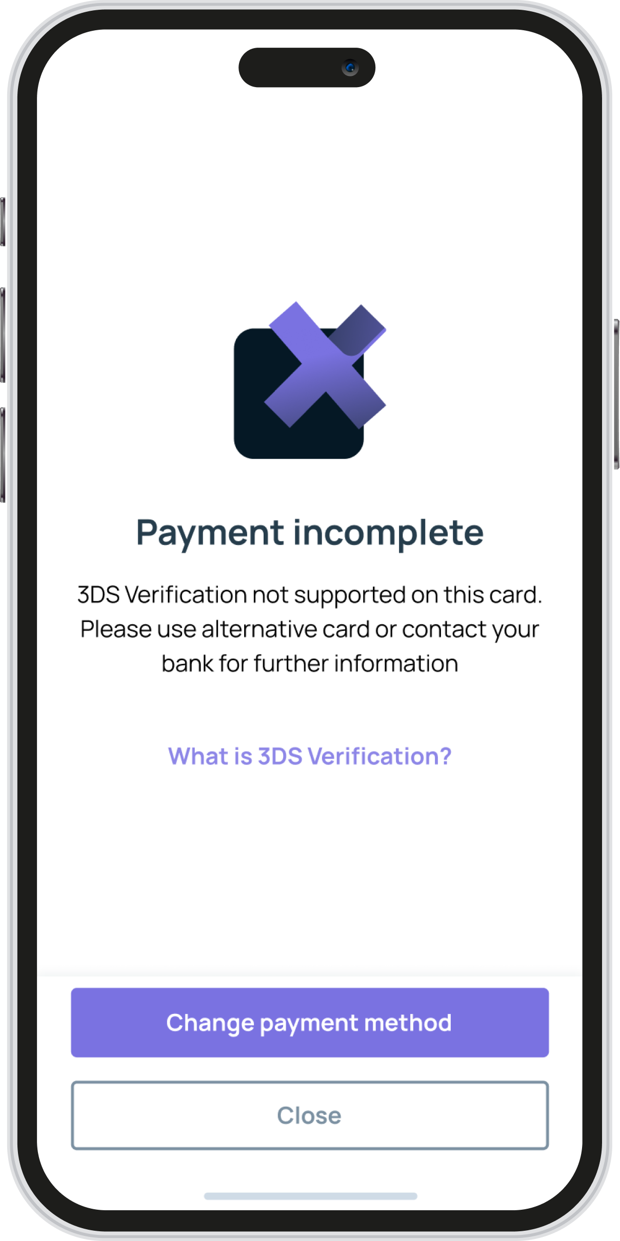
Improve error handling by feedbacking to user specific criteria of deposit failing & offering the right fallback option to users.
Idea & prototype
Cross platform consistency
Improved experience by offering a consistent interface accross devices, which we lacked of until now.
Opportunity 1: Simplify deposit experience for users who do recurrent deposits
Opportunity 2: Reduce friction between user and product when deposit is unsuccesful & sense of trust with product
Idea & prototype
Withdrawal
More context on this flow before redesign:
No reference whatshoever to return to source policy limitations
User completes full flow to find out at the end they cannot make the request, but they don’t know why.
There is no feedback of how much user can withdraw nor through which sources can be done. Users need to get feedback from CS about the exact amount they can withdraw with each source.
These are the ideas for the redesign:
Display a label to inform user how much is available to withdraw.
User gets inline feedback when amount inputed exceeds funds available
User can see all payment sources on screen
Payment sources are disabled by default, and when user inputs an amount, eligible sources change to enable status.
Provide trust & transparency to users on why not all sources can be used for withdrawal as per legal constraints, by displaying a modal onTap of info box on. This modal will inform maximum amount that each source can withdraw and a tertiary button for user friendly information about restrictions on withdrawals.
Opportunity 3: Redesign withdrawal flow in a way that allows users understand from how much & from which sources they can withdraw funds.
Idea & prototype
Withdrawal
When user inputs amount for full funds belonging to multiple sources, display a card offering to add a bank account
Semi automate process by allowing users to input their bank account details, and attaching bank statement when needed.
Opportunity 4: Work out how we can improve experience when users want to withdraw full funds in one request
Idea & prototype
Withdrawal
Banner on dashboard that onTap directs you to payments. After deposit done, banner disappears from dashboard
👉🏻 Out of scope ideas: A dynamic walkthrough platform for new authorised users.
👉🏻 My hypotesis is that the problem with first time deposit may lie on unmet expectations with the trading product as a whole & requires a deeper understanding of personas and research that was out of scope for this payments redesign project.
Opportunity 5: Encourage first time deposit on unfunded users
🕹 Usability testing & user interviews to validate design
number of participants
🙋🏾 5 people
scenarios covered
🕹 Main deposit flow, Open banking deposit option
🕹 On a recurrent deposit, select a new payment method
🕹 Store a card on app
🕹 Withdrawal, withdrawing full funds & nomination of bank account
Insights
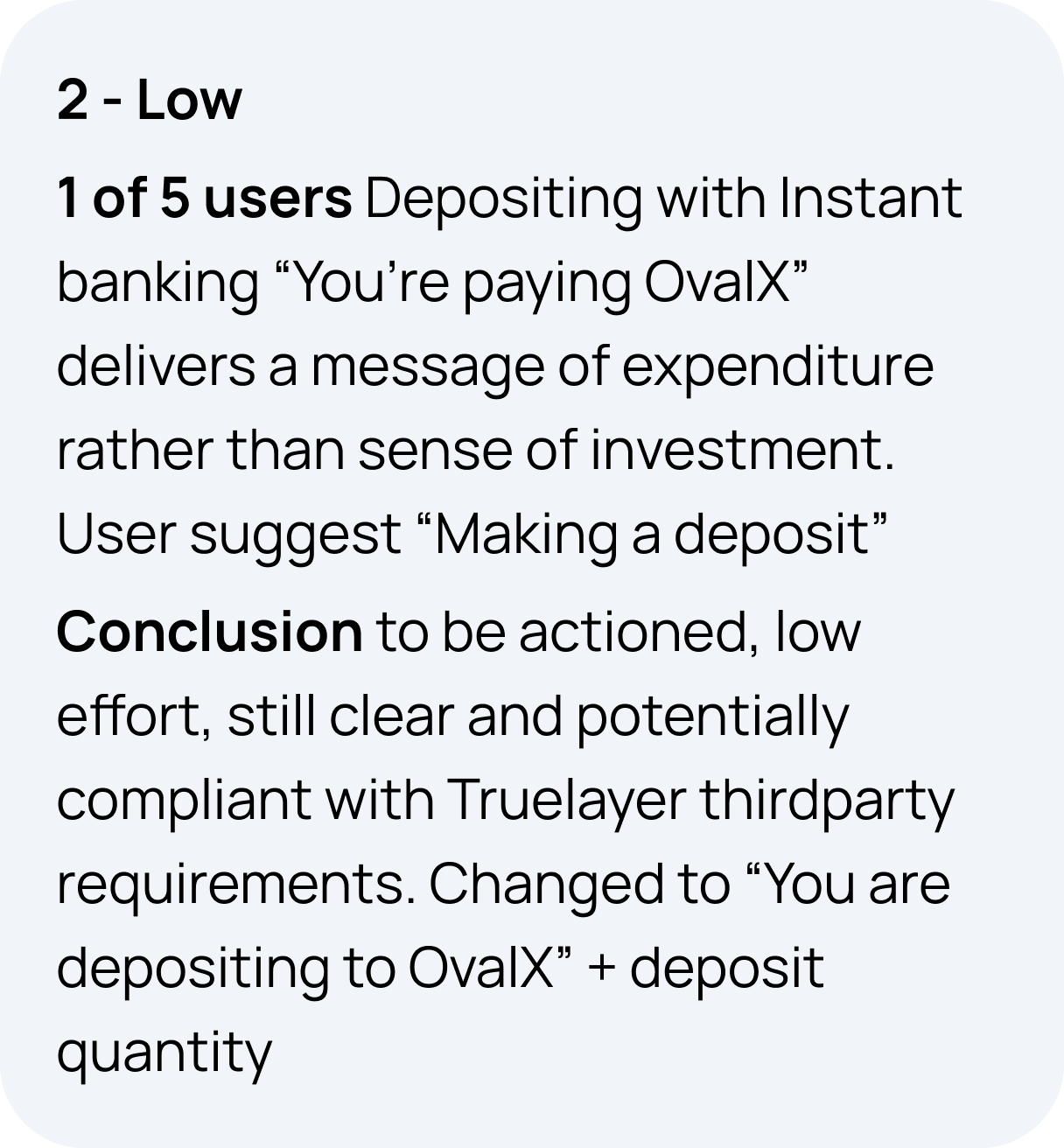
In general the usability of the design was validated, with the following insights:
🚀 How do we build it?
Feasibility was discussed with product manager and dev team lead during ideation phase.
At this phase, we exchange with product manager how we can break down project into sections, which section are priorities, so product manager creates a work breakdown structure to guide us on deployment.
For this project, the priority is building card management section first, which is correlated with product remembering payment options to improve deposit experience. On a later stage we planned transaction history and withdrawal userflow
🪄Visual design
I share with developers Figma files and updates on design system. For this product, I work on creation of any new components and the maintenance of 4 libraries, desktop and mobile, with support on light and dark theme.
♻️ Usability metrics
At the start of this project we had insufficient quantitative data to understand the drop on level of deposits, and limited qualitative data of users pain points.
To change this trend, I suggested the following usability metrics to track success of design & identify at which step on the journey there’s a significant drop rate.
These are the metrics I suggested tracking:
📈 Binary success - % (how many people reach the goal)
📈 Completion rate - % ( How much of the task has been completed)
For which flows?
🕹 Flow 1: Card management section, users adding payment methods
🕹 Flow 2: Deposit , users that start deposit process vs finish flow. Track each payment methdod separately (Open banking/ Card/ Skrill). Separate first time deposit from successive deposits.
🕹 Flow 3: Withdrawal, no bank account needed. Users that start withdrawl process vs finish. & how much fo the task has been completed.
🕹Flow 4: Withdrawal, nomination of bank account needed. tracking same than above.
👉🏻 Next steps
Once we receive data form these usability metrics, we can analyse results analize it and understand where there is room for improvement.


